National Security Agency Website Redesign
Project Overview
When starting this project a thorough analysis was conducted to understand what goals for this redesign would be. Consistency was a key issue throughout the National Security Agency (NSA) website. Consistency in buttons, standard functions, simple explanations, transparency, and proper warning when redirecting to a different website or video was a key issue throughout the NSA website. After research it was concluded the goal of the NSA website was determined to be to educate the public on the history and importance of the NSA . My focus for this redesign was to create an easy to navigate and understand, cohesive, and educational website. The finished product I was able to improve the overall function and goals of the NSA Website. After viewing this case study I hope you conclude that this redesign was necessary in the improvement of the NSA website.
MY ROLE: UX/UI Designer
TEAM: Jacqueline Camacho
TOOLS USED: Miro, Figma, Invision, Google Suites, Slack, Zoom, Trello
TIMELINE: April 30, 2022 - May 24th, 2022
THE PROBLEM
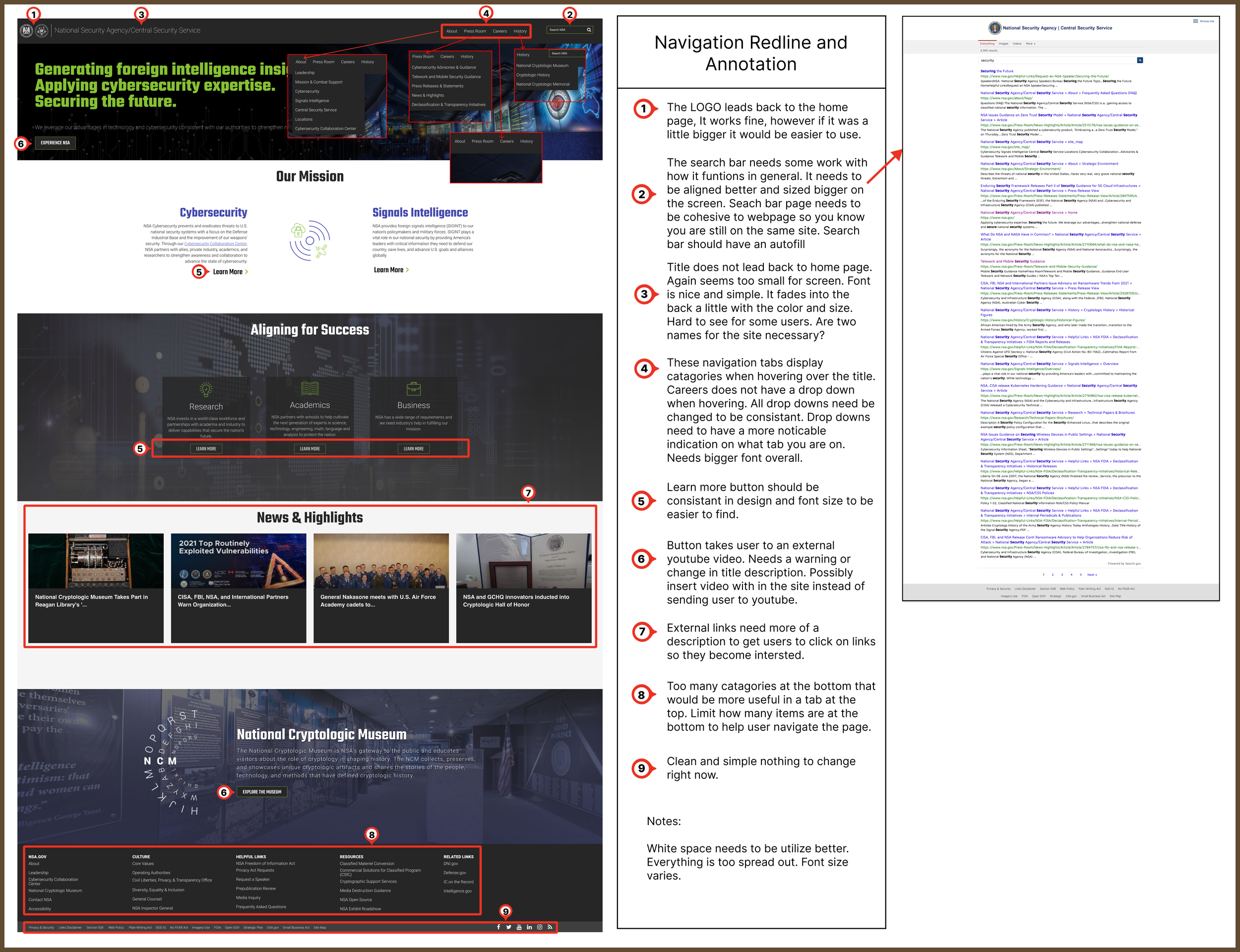
The NSA website was very inconsistent. For starters the drop down menu was not available in all navigation tabs. The logo and title name does not lead back to the homepage like most websites should. Search bar leads to a page that looks very different from the main page. On the call to action page there is a button that is called “Experience NSA” that leads the user to youtube and starts automatically playing a videos without warning the user. Useful information is available at the bottom of the page or by clicking on many links and deep diving on the website. Areas in the website can be hard to read because of font, font size, or color choice or distracting backgrounds. The call to action could be difficult for some users to understand what the NSA does or what this website is intended for. In general site is difficult to navigate by links leading to un-useful information, as well as information being hard to find. Lastly there are no back buttons available when navigating from page from page.
THE SOLUTION
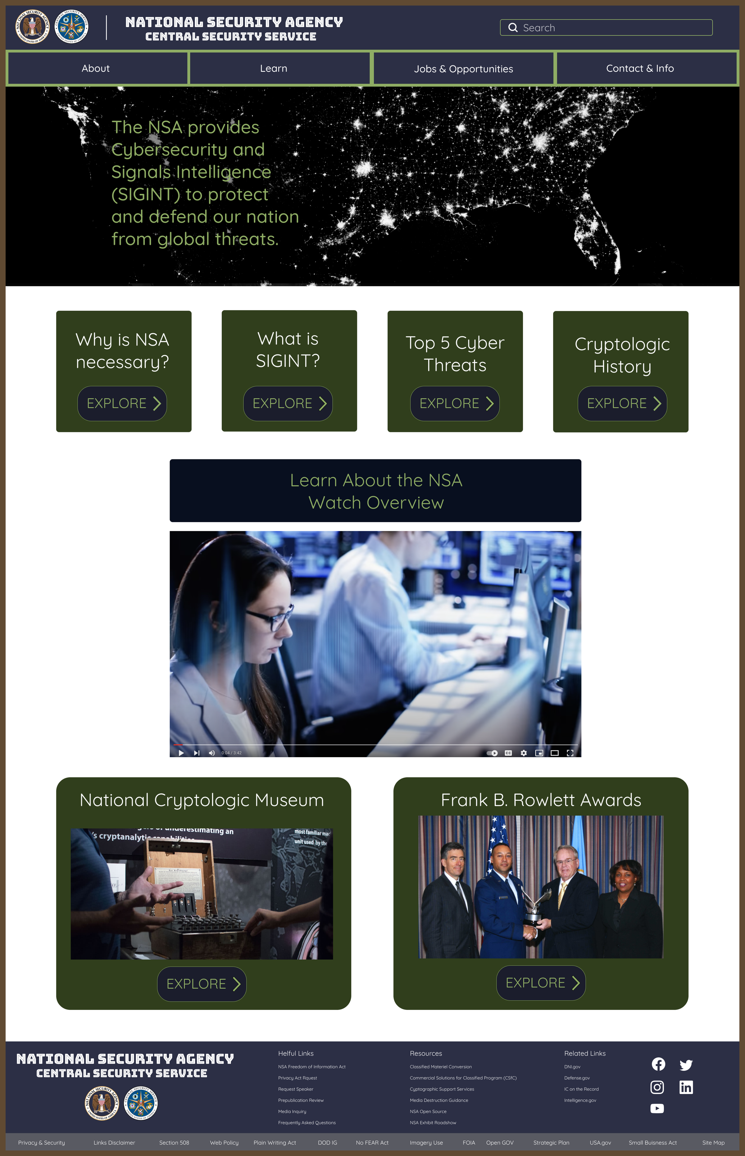
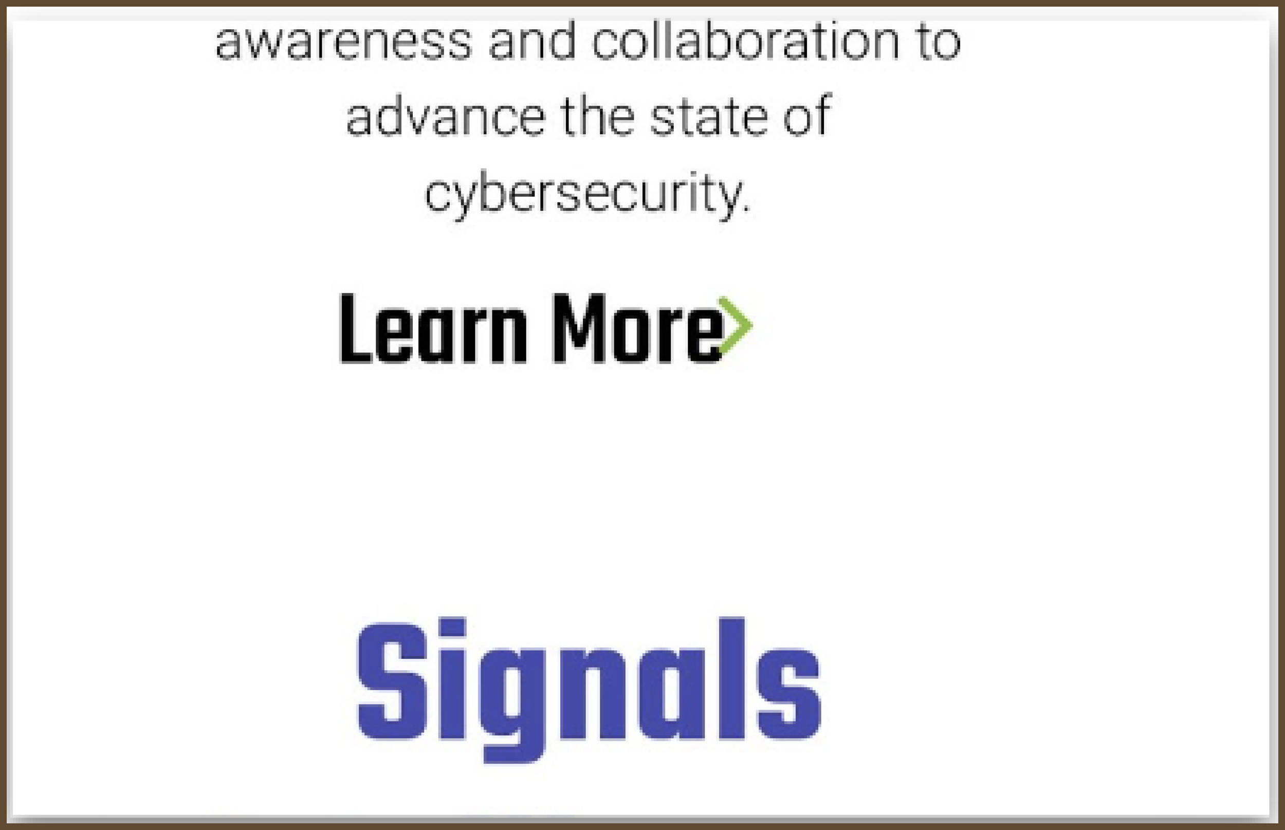
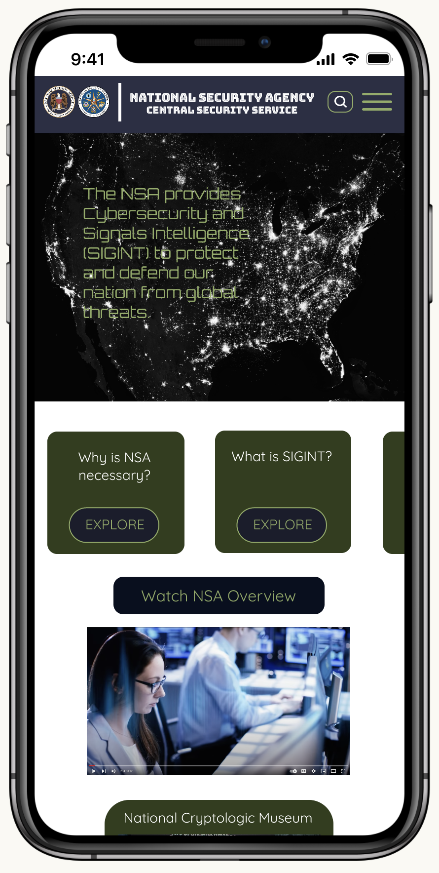
My solution to solving the issues that were discovered on the NSA website, was to focus on the most important changes needed then expand out from there. I started by making the important information stand out and reorganized the structure of the content of the entire main page through user testing, surveys, and card sorting. Next was establishing a short and simple call to action. It is also very important to get the attention of the users fast by making the homepage simple and with educational information at the top of the page. I also chose to highlight the video that was attached the original “Experience NSA” button in the middle of the page to give users the option to view it and understand that the video is about. I also made it a priority to make buttons, fonts, style easy to use and navigate. With all these changes I created a clean and simple to use website that is still colorful and bold that helps the user get the educational information they might need.
USER RESEARCH
We conducted an heuristic evaluation of the NSA’s website along with some user testing. Based on the results we concluded that the usability of the website need to be improved overall. Users had difficulty explaining the purpose of the NSA after using the website. When given at task to learn about SIGNIT or Cryptologic it took them awhile to find information on the topics.
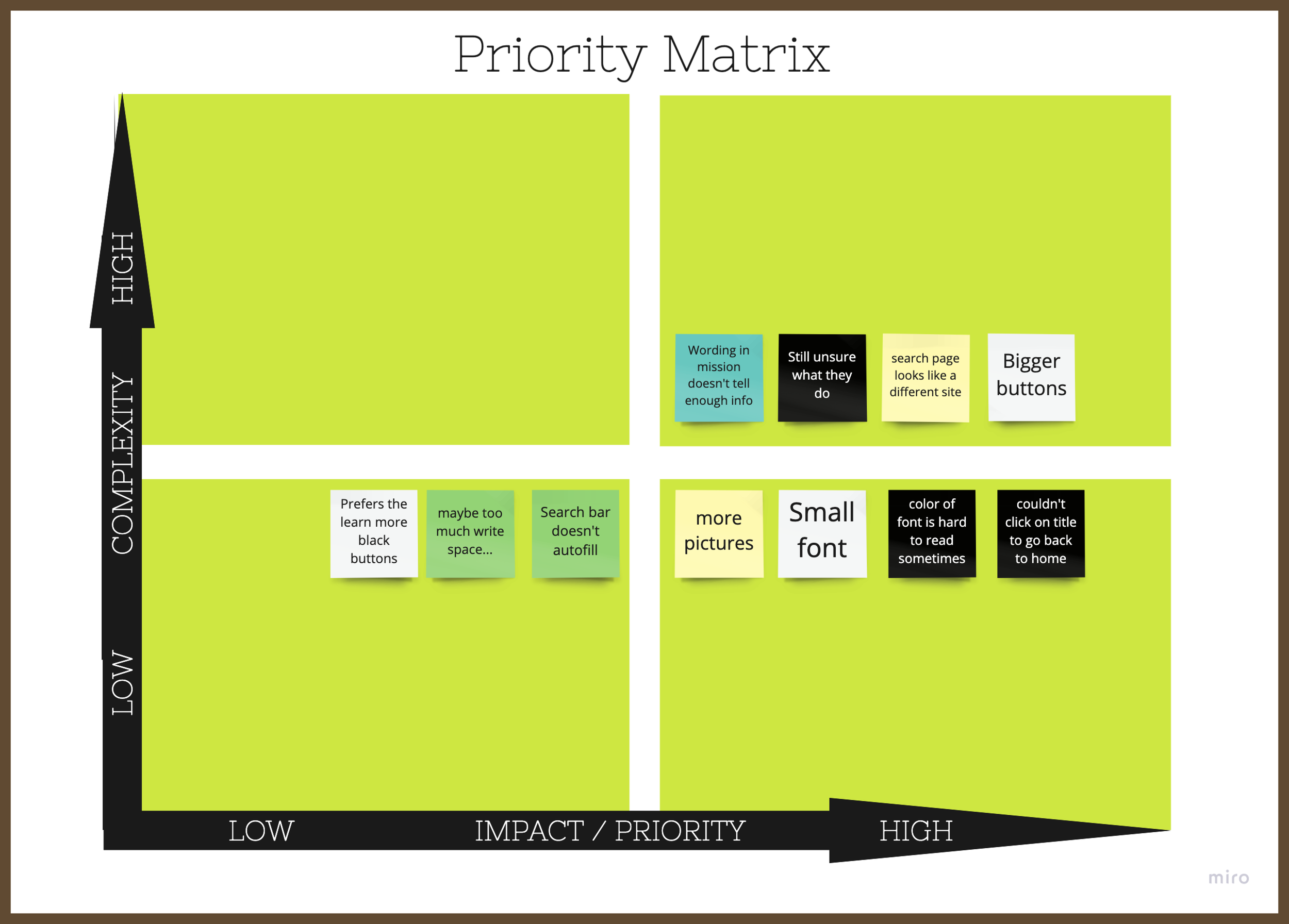
After a surveys, interviews and test were conducted I organized the information into an affinity diagram, empathy map, user persona and a priority matrix. The priority matrix was very helpful when prioritizing the elements needed on the redesign.
DESKTOP TESTING
Above example shows this navigation that is only available on some pages but not all. Users might look for it and not be able to navigate from page to page.
Not all dropdowns categories in navigation tab are shown when clicking on main category.
A back button would be helpful.
Search bar does not have autocorrect or fill.
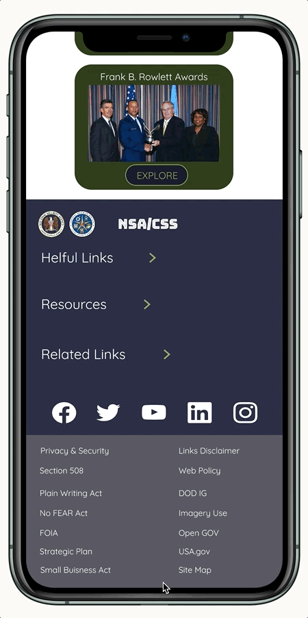
MOBILE TESTING
Seem like website was designed mobile first (which is great)But was not adjusted overall to fit for desktop.
Mobile hamburger menu doesn’t have dropdown for careers(same for desktop).
Fast working when loading and opening tabs.
Search zoom user in when selected. User has to zoom out select the search icon.
Search page is easier to user than the desktop.
Font too big for mobile.
Learn More arrow not aligned well
Top feature from Priority Matrix:
1. Give Users more useful information at the top of the page to engage the user.
2. Change font style, size and color.
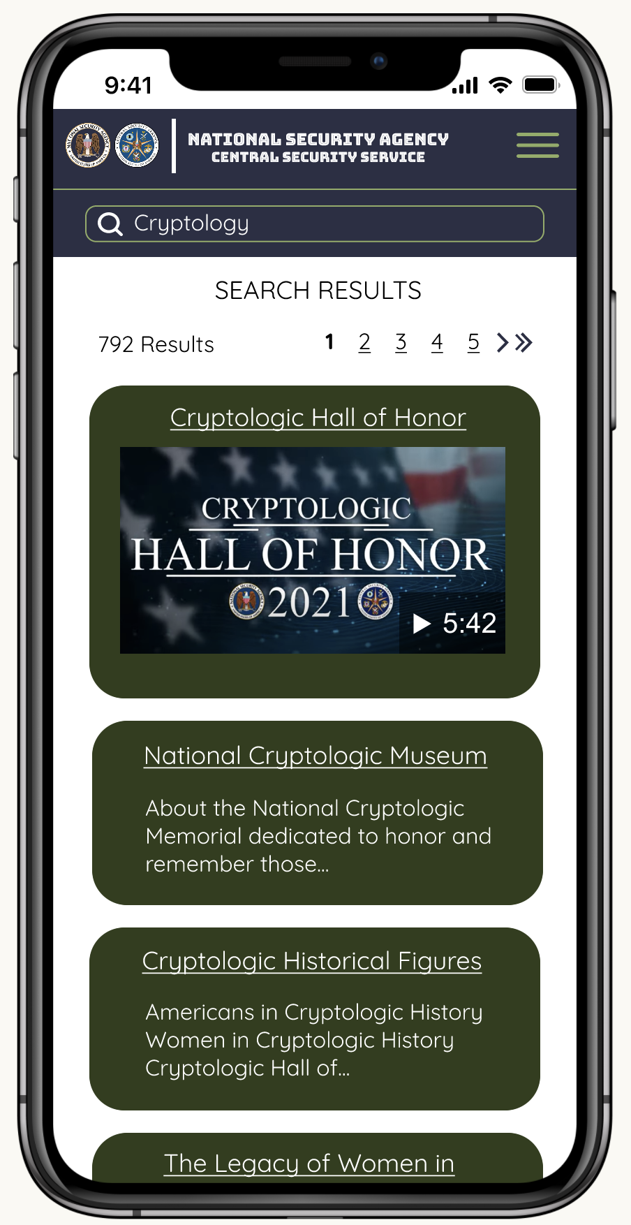
3. Change search page to look like main page.
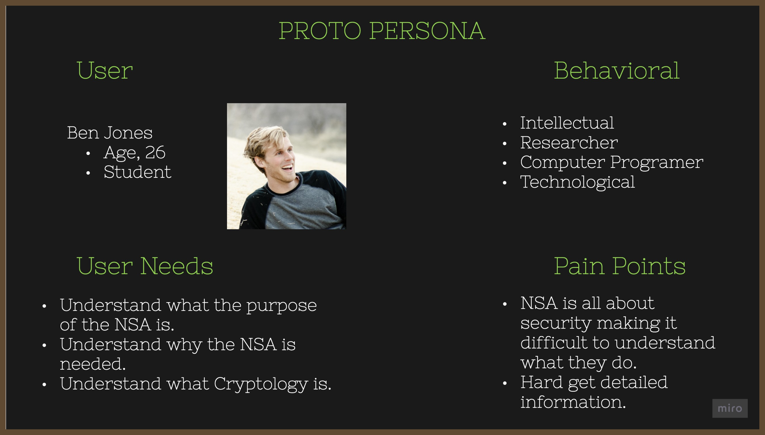
A user persona was created to show all the user needs, pain points and type of user who might be using this website.
IDEATION
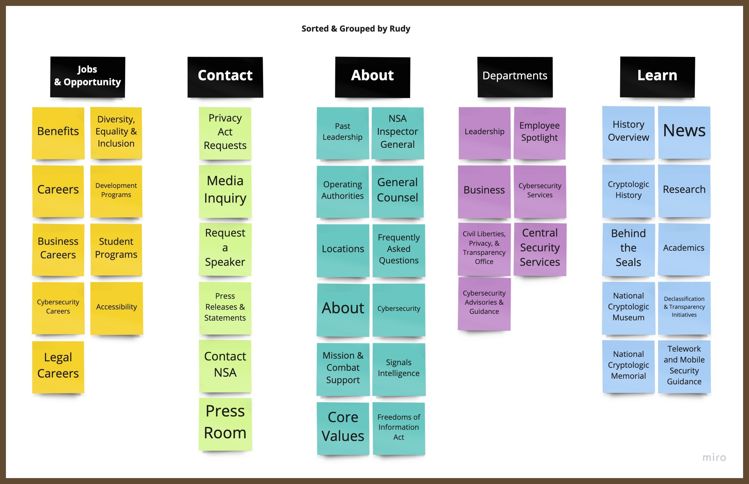
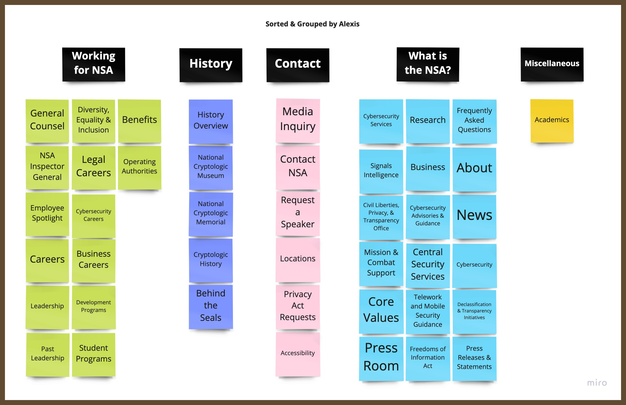
To prioritize the organization of the information and topics on the main page I conducted card sorting test to narrow down the structure.
CARD SORTING
UNSORTED AND UNGROUPED
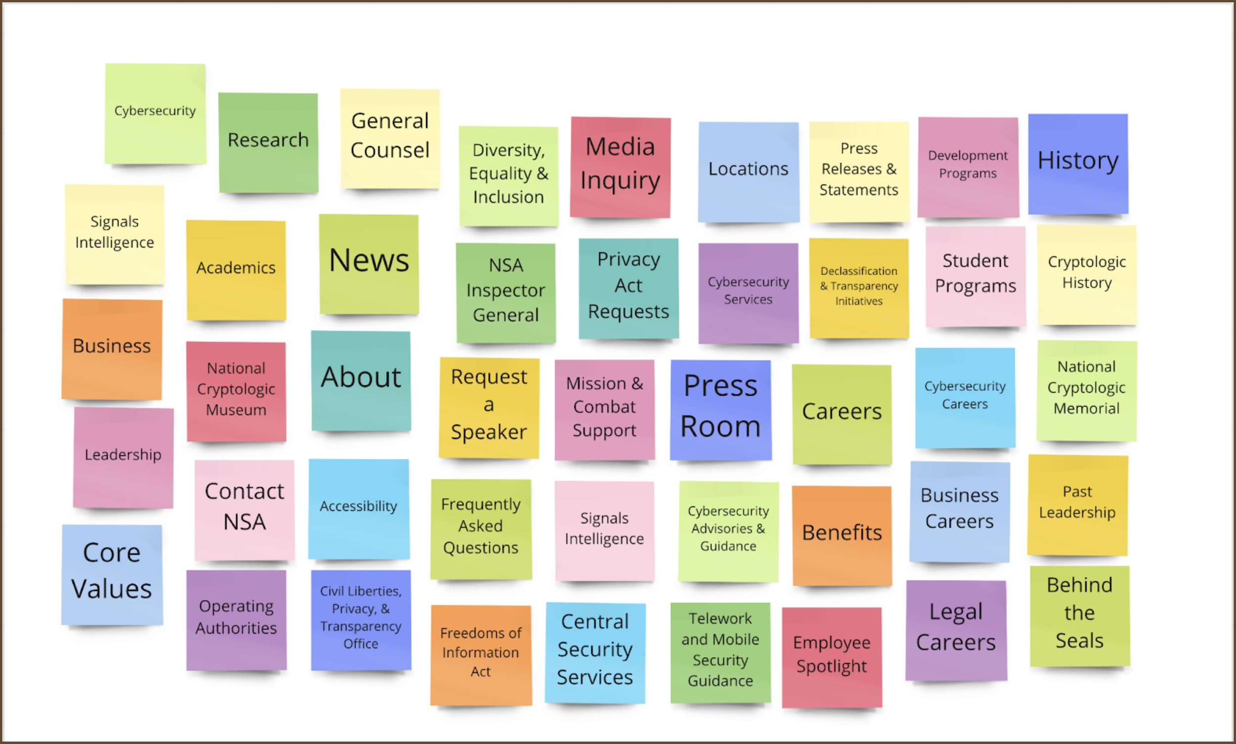
SORTED CARDS
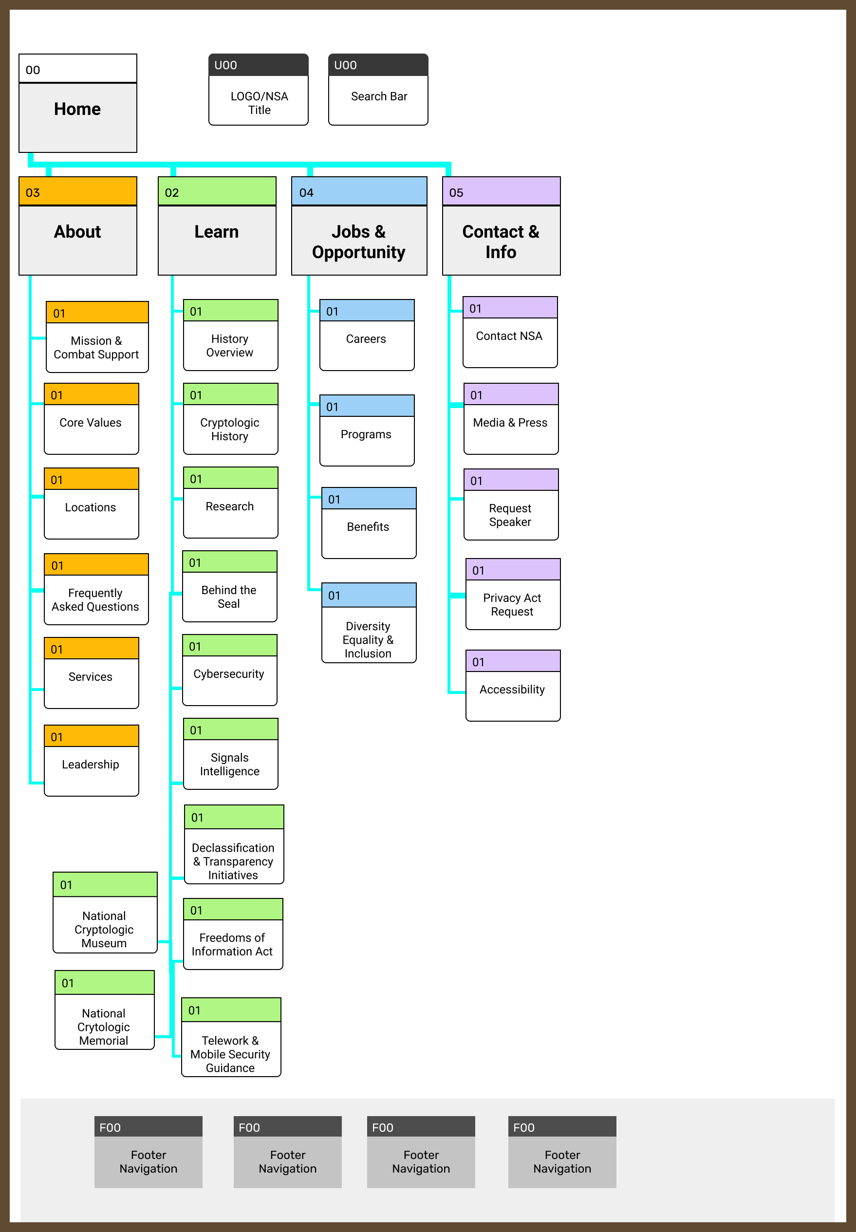
SITE MAP
This site map shows how the navigation tag categories will be organized.
WIREFRAMING, PROTOTYPING, AND USER TESTING
I began with mobile wireframes and slowly started to add color and designing the navigation and the footer of the main page. I focused on this as the navigation became one of the priority on the project. Clickable prototypes were created at each stage to test in order to optimize the function of design. The organization of the page was changed slightly after test in order to establish a hierarchy.
CHANGES AFTER USER TESTING
Font is hard to read
Add more images
More text related to NSA to understand what we are looking at
Work on alignment
Move info video to the top
Place search bar on the main page, outside the menu
low fidelity
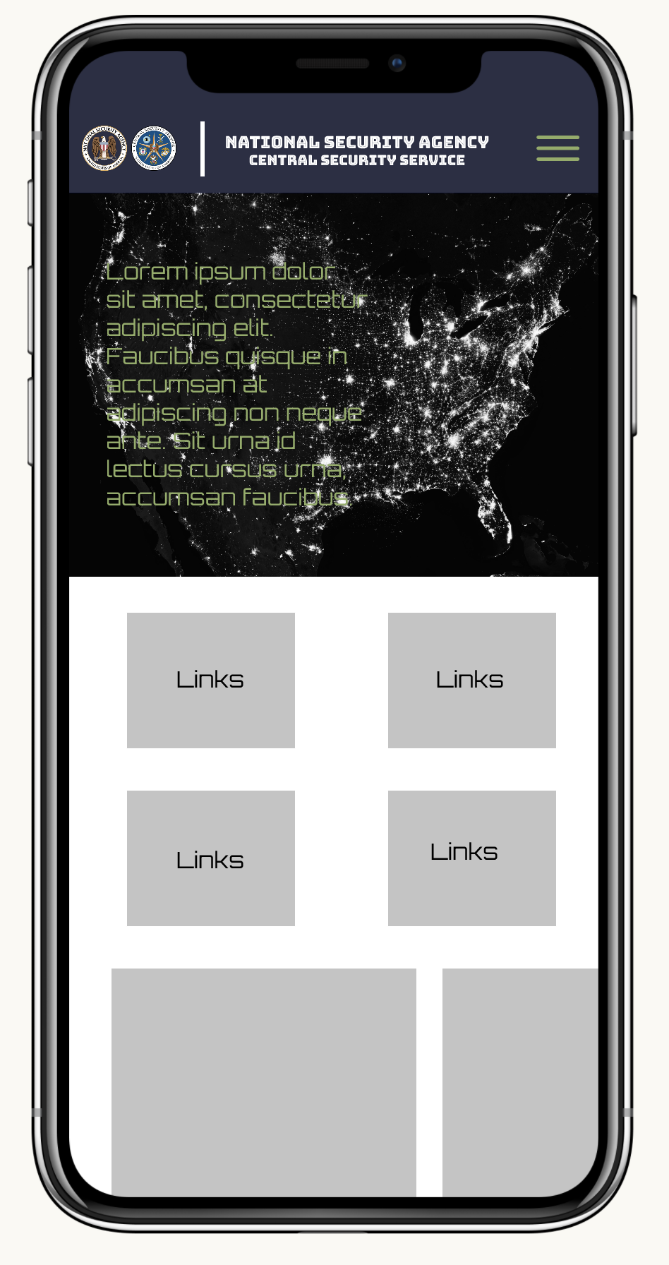
mid fidelity
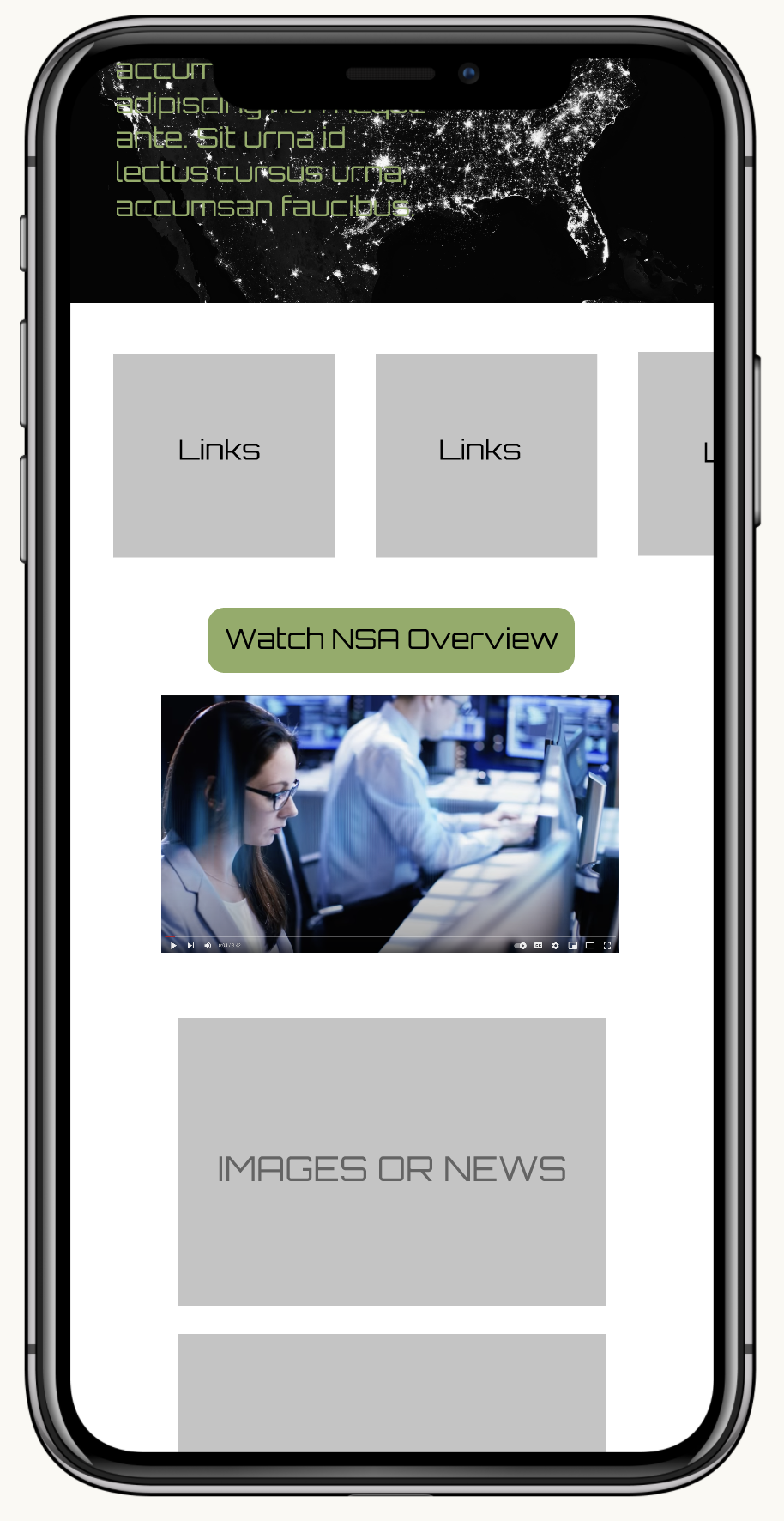
high fidelity
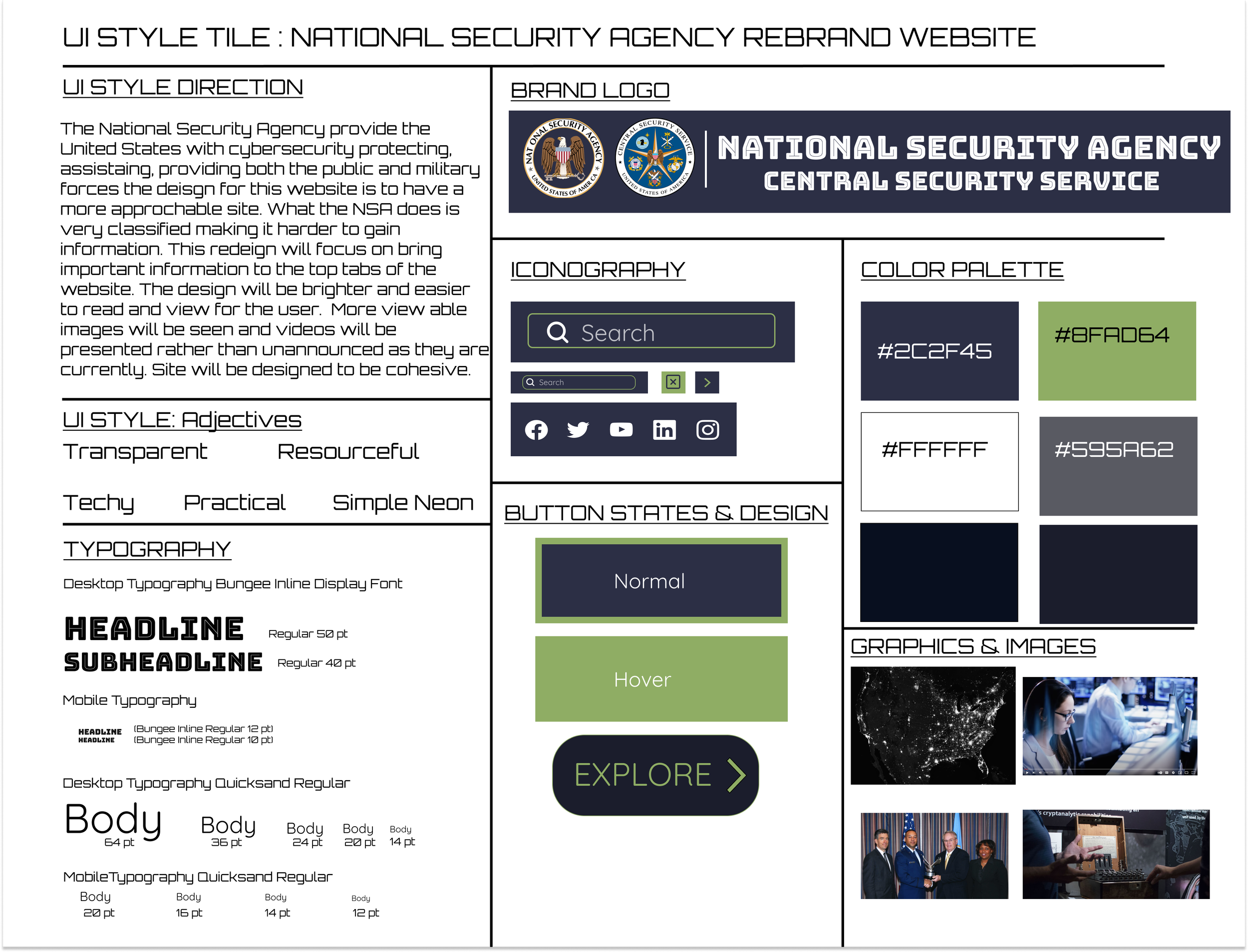
STYLE TILE
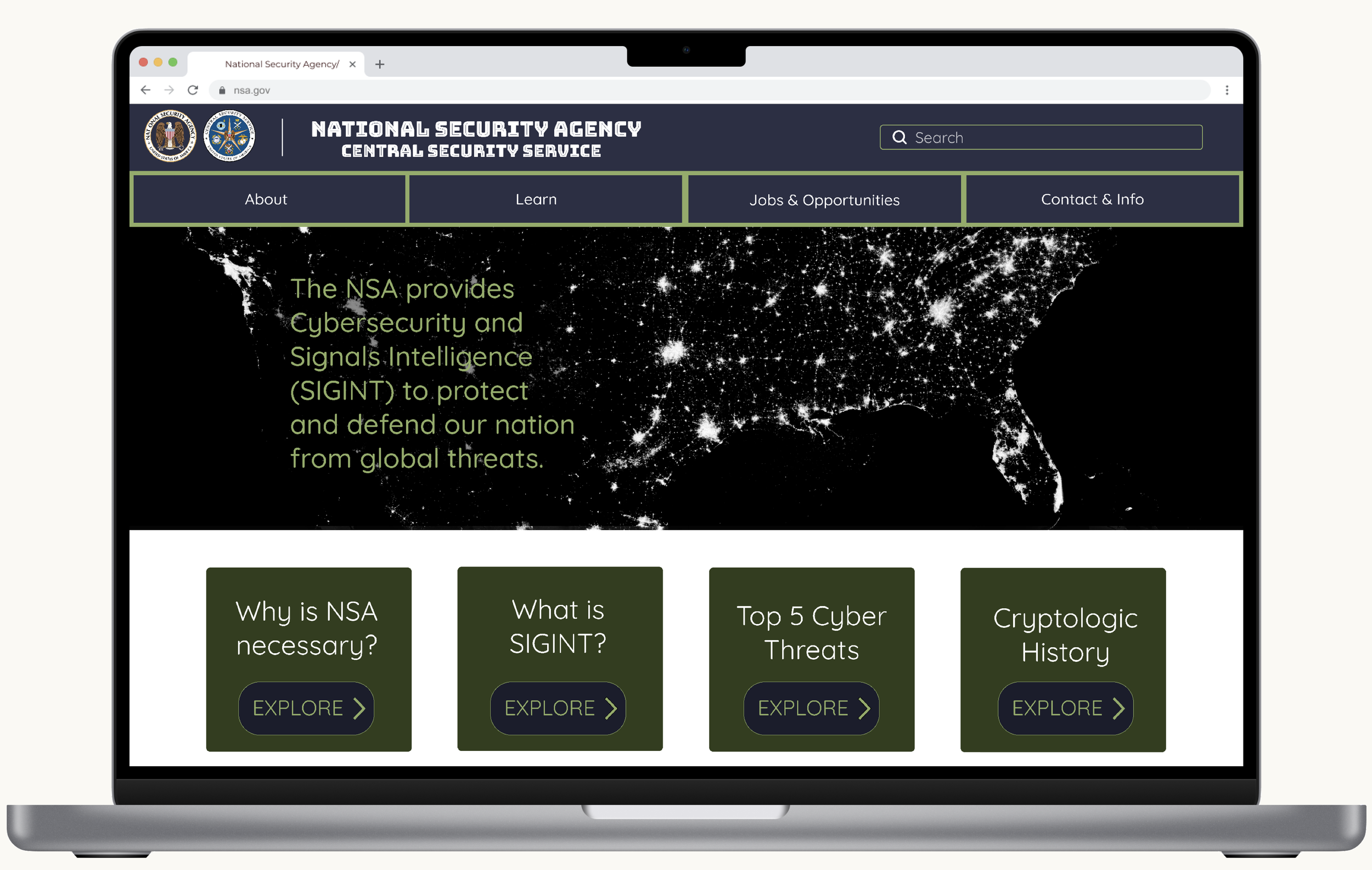
FINAL HIGH FIDELITY UI PROTOTYPE
REFLECTION
My final prototype made the NSA website easier to understand and navigate. The card sorting was a big help in narrowing down how to organize the overall website. The new call to action mission statement is simple and easier to understand. Users are now able to get information easier and gain a deeper understanding of the NSA and their impact in the United States of America. Changing the search page to be cohesive with the home page make the website more trustworthy to use. It avoids the issue of the user thinking they have been navigated to a different site without their consent or knowledge. Overall I felt these changes were necessary to create a more transparent user friendly website. I hope you agree!