Angel Paws Website Redesign
Project Overview
This project was created with the hopes of helping this non-profit have more traction via their website. At first glance it was unclear what the mission statement or goal of this non-profit was. Through research discovery Angel Paws primary goal was narrowed down to adoption services. This became the project focus as my team ideated, wire-framed and prototyped. Our finished redesign became a more focused, transparent, and inviting website compared to the original product. My hope after viewing this case study is that you come to the same conclusion.
MY ROLE: UX/UI Designer
TEAM: Jacqueline Camacho, Max Behrmann, Brent Reynolds
TOOLS USED: Miro, Figma, Invision, Google Drive, Slack, Zoom, Trello
TIMELINE: May 23, 2022 - June 15th, 2022
THE PROBLEM
Angel Paws adoption process was basically non-existent with minimal viewing and adoptions options on their original website. It was unclear what their focus was for their non-profit. There was no call to action or mission statement on their website. Low resolution images are utilized throughout the website. Transparency also raised an issue as it was unclear how to make a donation.
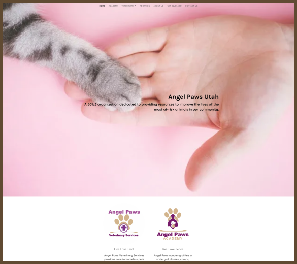
ORIGINAL WEBSITE DESIGN
THE SOLUTION
Angel Paws adoption process was basically non-existent with minimal viewing and adoptions options on their original website. It was unclear what their focus was for their non-profit. There was no call to action or mission statement on their website. Low resolution images are utilized throughout the website. Transparency also raised an issue as it was unclear how to make a donation.
USER RESEARCH
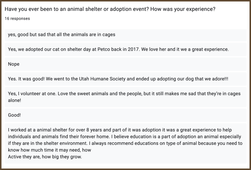
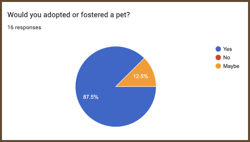
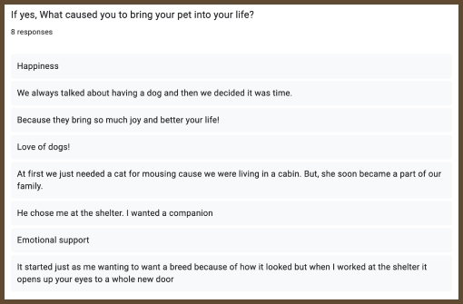
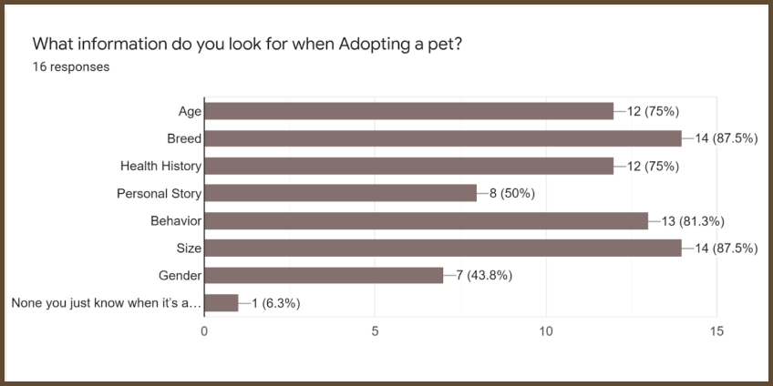
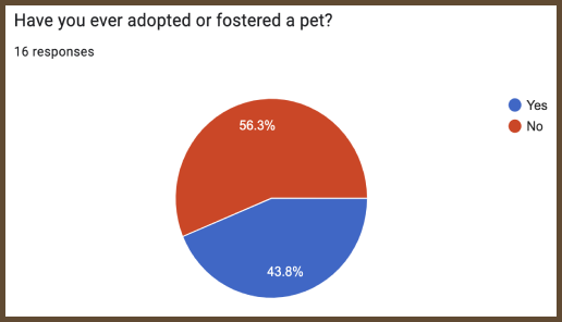
We conducted an analysis of Angel Paws and other shelters and rescues, vets, and adoption service websites both locally and nationally to familiarize ourselves with the industry. We determined that fleshing out their adoption services on their website to be the most helpful improvement we could offer to Angel Paws. We did 4 recorded user interviews to gauge people’s experiences, knowledge, and interest level about pet education, training, adoption, and ethics. We found out users need good photography of the animal, and they look for temperament, gender, and age the most to determine interest. We also determined through our interviews and survey results that most people have a negative experience adopting animals from shelters so we set out to improve their journey through the process as well. Our survey also made use of narrowing down the key features people look for when adopting a pet.
SURVEY RESULTS
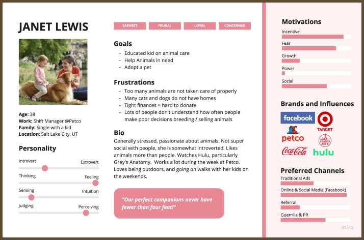
From the results from User Research we created our user persona Janet Lewis.
Janet wants to adopt a suitable pet for her and her daughter. Janet would like to be confident she is picking the right option and fully prepared to take care of her pet correctly.
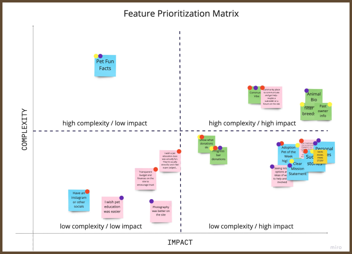
We conducted a empathy map to deterime features, pain points, and gains. After we created a feature prioritization matrix to narrow down what features we discover during our user reaseach.
Top feature from Priority Matrix:
1. Detailed animal information
2. Tell the story of Angel Paws better
3. Demonstrate transparency and financial goals.
IDEATION
Based on our user research we determined the features that users would enjoy seeing along the journey of the pet adoption process with Angel Paws.
Detailed Features:
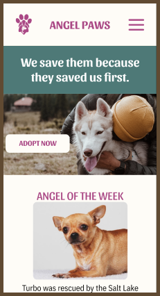
1. A clearer mission statement, explanation of Angel Paws, and their story.
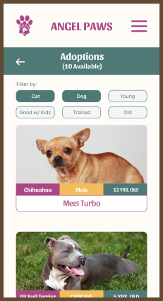
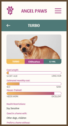
2. Detailed information about each animal
3. Angel Paw donations goal and progress bar.
4. Pet of the week feature on main page - putting their focus at the center
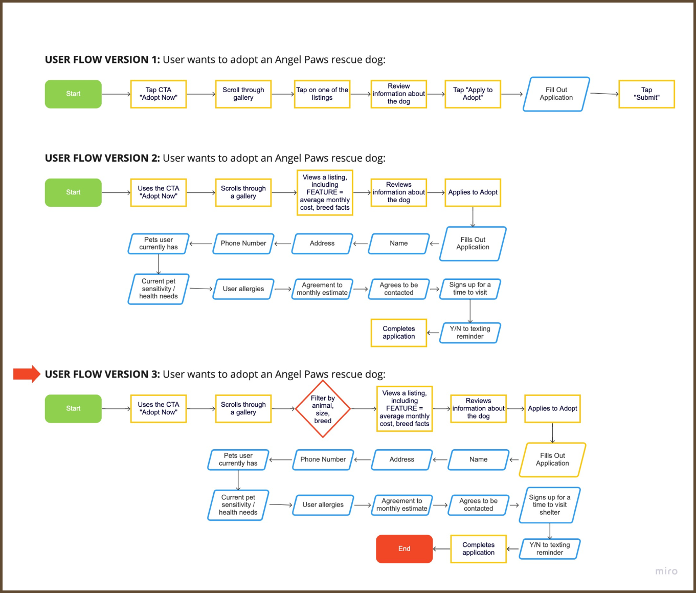
We started our user flow very broad including each of the three things Angel Paws currently offers—education, veterinary services, and adoption. We decided to focus on adoption services as our primary flow. Below you can see we iterated three times till we created a solid user flow outlining exactly the users journey to adoption on Angel Paws’ website.
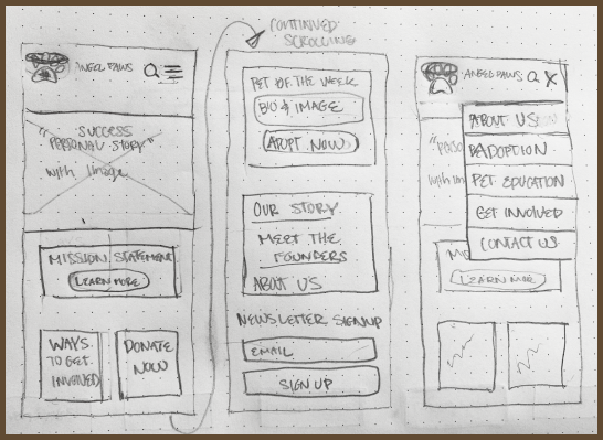
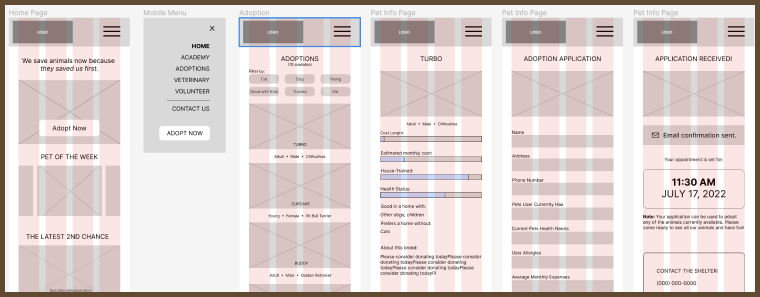
WIREFRAMING, PROTOTYPING, AND USER TESTING
We began with hand-drawn moblie wireframes, which were converted into low fidelity wireframes that could be connected together in Figma to create a clickable prototype. At this stage, we focused on how we might best implement those top four features we outlined above.
We did user testing at each stage to ensure we were effectively implementing our features and creating a website for Angel Paws that better accomplished their end goal of adoptions, donations, and paved the way for future work.
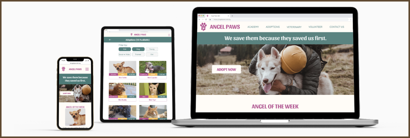
During testing using their current colors and logos, we iterated them to create a more playful, positive, and engaging web experience to help offset the heavy, depressing subject of euthanization and shelter animal ethics. Our users found these designs to be increasingly clear, enjoyable, and motivating at each stage of development.
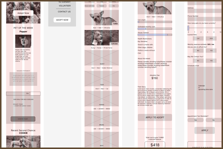
FINAL HIGH FIDELITY UI PROTOTYPE
REFLECTION
Our team protype elevate website for Angel Paws creating a higher functioning website for Angel Paws. Their mission was clearly stated, adopting pet they rehabilitate was the focal point of their site and donations were made transparent. All of our research and strong collaboration we had together made it possible to create this strong website. There was a dramatic shift in the change we did for Angel Paw’s website. Overall we created a happier, clean and navigable site. I hope to continue working on this website to show the other services that Angel Paws provides. Hopefully in the future we will be able to get in touch with the team at Angel Paws and collaborate to improve their overall website. I am proud of our final product and hope to continue improving what we already have.